
Imagine you’re strolling down Cary Street on a crisp fall morning. The shop windows are dressed in their seasonal best, each one telling its own story, inviting you in without saying a word. That’s the silent magic of aesthetics — a language without words, speaking volumes. It’s much like the art of web design, where your homepage is the window display to your business, and every pixel should invite your audience to come inside.
There was a website I visited not too long ago that stuck with me. It wasn’t the most flamboyant, nor did it have the most cutting-edge features. Instead, it had mastered the art of simplicity, with a color scheme that felt like the first leaves of fall and a layout so intuitive, I felt like it was reading my mind. It was unforgettable because it was crafted, not just built. That’s the power of aesthetics done right — it turns a casual browser into a loyal customer.
Transform your site with the art of minimalism – where less is more and clarity is king.
In this space, where code meets creativity, some trends are the equivalent of a flash-in-the-pan — brilliant today, gone tomorrow. But then there are elements that form the cornerstone of timeless design. As we explore the do’s and don’ts of modern website aesthetics, let’s unravel how to create that balance, ensuring your site not only captures the essence of your brand but also weaves an enduring digital narrative.
By the end of our chat, you’ll walk away with more than just tips; you’ll have a new lens to view your website through. It’s about crafting a space that’s not just seen but felt, not just browsed but experienced. This is where your journey for an impeccable website design begins — right here, with us, today.
In this article:
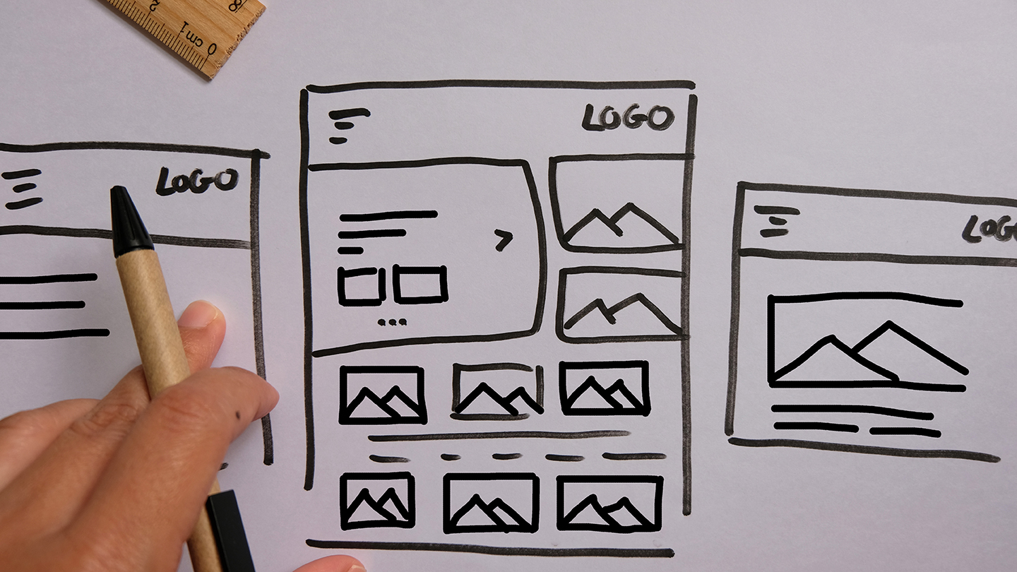
This guide covers the essential do’s and don’ts of web design. Learn how to create a visually appealing, functional, and user-friendly website with tips from RVA Site Co.
The Power of Simplicity: Do Embrace Minimalism
You know, there’s something to be said for the charm of a clean, uncluttered space. It’s like walking into a room where everything has its place, and there’s a sense of peace that comes with it. That’s the essence of minimalism in web design. It’s not about being bare or boring; it’s about being purposeful. Every element on your site should feel like it belongs, serving a clear function without any excess noise.
Remember that time you visited a website and were immediately bombarded with pop-ups, flashing ads, and a cacophony of colors? Felt overwhelming, didn’t it? That’s the antithesis of minimalism. Now, think about the last time you landed on a page that was so well organized that you found what you needed effortlessly. That’s the power of a minimalist approach — it creates a path of least resistance for your users, leading them exactly where they need to go.
Crafting Clarity with Your Design
Let’s break it down. A minimalist website focuses on the core components:
- Content: It all starts with your message. What are you trying to say? Strip it down to its essence and let that guide the design.
- Imagery: Choose images that speak volumes without the need for words. A single, powerful photo can do the work of a thousand pixels.
- Layout: Keep it clean. Ample white space isn’t just visually relaxing; it helps to highlight the areas that matter most.
In a world that’s constantly vying for our attention, minimalism is the quiet revolution. It’s an invitation to slow down, focus, and engage with content that truly matters. By embracing minimalism on your website, you’re not just following a design principle; you’re creating a haven for your customers to enjoy the simplicity and straightforwardness of a well-told story.
Bold but Accessible: Do Use Color Wisely
Have you ever noticed how certain colors can make you feel? Like the way a deep blue can calm your mind, or a vibrant yellow can make you feel just a bit more cheerful? Color is a powerful tool in any designer’s palette, and when used wisely on your website, it can evoke these very emotions in your visitors.
Colors speak louder than words. Choose a palette that tells your story and sets the mood on your website.
Picture a quaint Richmond café you love, with its warm hues inviting you in, creating an ambiance that you want to return to. That’s the feeling you want to capture. It’s not just about picking colors you like; it’s about choosing the ones that resonate with your audience and reinforce your brand message.
The Language of Color in Design
When it comes to color on your website, there are a few key things to keep in mind:
- Contrast and Readability: Your text should pop off the background, clear and legible, not lost in a sea of similar tones. High contrast is not just a stylistic choice; it’s a necessity for accessibility.
- Color Psychology: Colors have a psychological impact. Choose a palette that aligns with the emotions and actions you want to evoke in your visitors.
- Consistency is Key: Use your brand colors consistently across your site. This not only strengthens brand recognition but also creates a cohesive visual journey.
Now, I’m not saying to shy away from bold choices. On the contrary, a well-placed splash of a vibrant color can be just the thing to draw attention to a call-to-action. The trick is balance. Too much color can be overwhelming, too little can be uninspiring. Find that sweet spot, and you’ll have a website that’s not only beautiful but also intuitively guides your visitors through their journey with ease and emotion.
Remember, colors speak louder than words. Use them to tell your story, set the mood, and create an experience that leaves a lasting impression.
Typography That Talks: Do Choose Readable Fonts
Let’s talk about fonts – those stylized letters that can shout, whisper, and converse with your visitors. There was this one time I stumbled upon a website, the kind that makes you lean in closer, not just because of the content but because of how the content was dressed – the font. It was sleek, modern, and it spoke in just the right tone, the kind that resonated with the brand’s voice. That’s when it hit me: Typography is not just about the words on the screen; it’s about how those words are presented.
The Character of Your Characters
Choosing the right font is like choosing the right outfit for an interview. It’s got to be appropriate, comfortable, and most importantly, it needs to make the right statement. Here’s the rundown on picking fonts that will do the talking for you:
- Clarity Comes First: The primary job of your text is to be read. Pick fonts that are clear and easy on the eyes across different devices and screen sizes.
- Personality Matters: Your font choice should reflect your brand’s character. A tech company might go for something clean and sharp, while a boutique shop might prefer something with a little more flourish.
- Pairing is an Art: If you’re using more than one font, make sure they complement each other. Just like a good wine pairs with the right cheese, the right combination of fonts can elevate the user experience.
- Mind the Load Times: Some fonts, especially those that are more graphic-heavy, can slow down your site. Choose web-optimized fonts that balance style and performance.
The right typography can make your visitors feel understood and at ease, guiding them through your site with subtle nudges and winks. It’s about creating a conversation without saying a word and making your site not just a page to visit, but a place to stay.
Typography is the suit or dress of your website – make it count.
The Pitfall of Overcrowding: Don’t Clutter Your Space
There’s a certain beauty in breathing room, both in life and on a web page. You’ve likely felt the calm that comes from a well-organized space, where everything feels like it’s in just the right place. Now, think of a website you’ve visited where every inch is packed with information, images, buttons, and texts. It’s like walking into a room where every wall shouts for your attention—overwhelming, isn’t it?
Clearing the Clutter for Clarity
Just as a cluttered store can deter customers, a cluttered website can deter visitors. Here’s why a clean, organized website is not just aesthetically pleasing but functionally crucial:
- White Space is Your Friend: White space isn’t wasted space; it’s a powerful design element. It gives content room to breathe, helps highlight important sections, and improves readability.
- Hierarchy Leads to Harmony: Establishing a clear hierarchy in your design helps guide visitors through your content in a logical, seamless manner. It tells them where to look first, second, and next.
- Simplicity Equals Sophistication: In the end, a website that utilizes space wisely exudes sophistication and thoughtfulness. It shows you value your visitor’s experience enough not to bombard them with excess.
A clean design with ample space doesn’t just make for a pretty website—it makes for a practical one. It respects the visitor’s need for visual comfort and clarity, making their journey through your site not just enjoyable but memorable.
So, before you add another widget or image, ask yourself if it serves a purpose. If it doesn’t add value, it might just be adding clutter. Remember, sometimes the most powerful statement is the one you have the restraint not to make.
Movement with Meaning: Don’t Overdo Animation
Let’s take a moment and think about those captivating street performers who can make a whole crowd stop and watch with just one well-timed, dramatic gesture. Now, what if every movement they made was that grandiose? It would be exhausting, right? That’s what it feels like when a website goes overboard with animations.
Why Too Much Motion Can Lead to Commotion
Animations should be the street performers of your website – purposeful, engaging, and memorable, not constant and overwhelming. Here’s the rationale for keeping animations to a minimum:
- Distraction from the Main Act: If everything on your website is moving, it’s hard for visitors to focus on what matters. They came to your site with a goal in mind; don’t let animations pull them away from it.
- Performance Takes a Hit: Every animated element is like a tiny performance, and too many can slow down the show – I mean, your website. For users on the go or with slower internet speeds, this can be a deal-breaker.
- Accessibility Takes Center Stage: Overdoing animations can make your site a no-go zone for people with certain neurological disorders or visual impairments. Inclusivity means ensuring your website is welcoming to all.
Embrace Subtlety in Your Site’s Choreography
Here’s how to incorporate animations that add to the user experience rather than detract from it:
- Make It Optional: Give visitors the control to pause or stop animations. This small act of consideration can make a world of difference.
- Prioritize Functionality: Use animation to enhance functionality, like drawing attention to a new feature or indicating a process is in progress.
- Test for Tolerance: Check your animations across different devices and user scenarios to ensure they’re enhancing, not inhibiting, the experience.
Animations, when used sparingly and thoughtfully, can elevate your website from mundane to memorable. They’re the accent, not the conversation. Use them to guide, delight, and occasionally surprise your visitors, but always with a keen sense of when less is more.
Mobile-First Mindset: Don’t Neglect Responsiveness
Have you ever tried to read a newspaper on a screen the size of a postage stamp? That’s what using a non-responsive website feels like on a smartphone. In this day and age, where our phones are almost like extensions of our hands, designing a website that doesn’t play nicely with mobile devices is like opening a coffee shop in Richmond without offering to-go cups – it just doesn’t make sense.
Adapting to Screens of All Sizes
The concept of a mobile-first design isn’t new, but it’s surprising how many websites still miss the mark. Here’s why optimizing for mobile is not just a nicety but a necessity:
- Mobile Usage is Skyrocketing: More people are accessing the internet via their mobile devices than ever before. Not catering to this audience is like ignoring a huge portion of potential visitors.
- Google Loves Mobile-Friendly: Search engines prioritize mobile-friendly websites. If you want to be found, you need to be responsive.
- User Experience is King: A site that’s hard to navigate on a small screen is a site that users will quickly leave. A good mobile experience keeps them engaged and happy.
Crafting a Seamless Mobile Experience
So, how do you ensure your website is as hospitable on a mobile device as it is on a desktop? Here are some pointers:
- Test, Test, and Test Again: Use various devices to see how your site performs. What looks good on a desktop might be a jumbled mess on a phone.
- Simplify Navigation: Mobile screens are smaller, so every pixel counts. Simplify your menus and keep the essential information front and center.
- Optimize Images and Media: Large images can slow down loading times on mobile devices. Ensure your visuals are optimized for quick and efficient loading.
Embracing a mobile-first approach is like ensuring every guest at your party feels welcome, no matter how they arrive. It shows foresight, consideration, and a commitment to providing a quality experience for everyone. And in the world of web design, that’s what sets the great apart from the merely good.
Imagery that Tells a Story: Don’t Use Generic Stock Photos
Let me paint you a picture: You’re browsing a website, and you see that same stock photo you’ve seen a dozen times before – you know, the one with people in a meeting looking unnaturally excited. It feels inauthentic, doesn’t it? Like a canned laugh track in a sitcom. In the world of web design, authentic, story-telling imagery can be a game-changer, setting your site apart from the sea of sameness.
Breaking Free from the Stock Photo Stereotype
Using stock photos is easy and convenient, but often, they fail to connect with your audience on a deeper level. Here’s why opting for more authentic imagery can make a significant difference:
- Create a Connection: Photos that are unique to your brand tell your story more effectively and create a stronger emotional connection with your visitors.
- Stand Out: In a digital space crowded with repetitive visuals, unique images can help your site stand out, making it more memorable.
- Reflect Your Brand Identity: Custom imagery can better represent your brand’s identity and values, aligning with the overall messaging and feel of your website.
Crafting a Visual Narrative
So, how do you move away from generic stock photos and start using images that resonate more authentically? Here are some ideas:
- Invest in Professional Photography: If budget allows, professional photos of your team, your products, or your work environment can add a personal touch that stock photos simply can’t match.
- User-Generated Content: Encourage your customers or clients to share photos of them using your product or service. This not only provides authentic imagery but also builds community.
- Be Selective with Stock Photos: If you must use stock photos, choose carefully. Look for images that are less widely used and more closely aligned with your brand’s personality.
Remember, every image on your website is an opportunity to tell a part of your story. Make it count. Authentic imagery not only beautifies your site but also weaves a narrative that visitors can relate to and remember.
Conclusion: Crafting a Site That Resonates and Endures
As we wrap up our journey through the do’s and don’ts of modern website aesthetics, it’s a bit like stepping back from a painting we’ve been working on together. We’ve mixed the right colors, chosen our strokes carefully, and created a composition that’s not just pleasing to the eye, but meaningful and accessible. This isn’t about chasing trends or adding frills; it’s about building a website that tells your story, engages your audience, and stands the test of time.
Why Choosing RVA Site Co. Means Choosing Excellence
In the bustling digital landscape of Richmond and beyond, your website needs to be more than just visually appealing. It needs to be a digital home that welcomes, informs, and connects with your visitors. At RVA Site Co., we understand this deeply. We believe in creating websites that are not only beautiful but also intuitive, inclusive, and effective.
- Expert Guidance Tailored to You: Our approach is not one-size-fits-all. We take the time to understand your brand, your vision, and your audience. This personalized approach ensures that your website is a true reflection of your unique brand.
- Focus on Longevity and Performance: We steer clear of fleeting trends and focus on designs that are timeless. Your website will be built to perform excellently today and adapt gracefully to the digital changes of tomorrow.
- Commitment to Your Success: Our job isn’t just to build a website. It’s to set you up for ongoing success, with a site that grows and evolves with your business.
Taking the Next Step Together
Creating a website that effectively represents your brand in the digital age is a journey, and it’s one you shouldn’t have to embark on alone. If you’re ready to build a website that mirrors the quality and passion of your business, we’re here to make that happen. Reach out to RVA Site Co., and let’s start crafting a website that not only meets your needs but exceeds your expectations. Together, we’ll create a site that’s not just seen but felt, not just browsed but experienced — a site that truly resonates.